SPIRITS | DISTILLERY
Motherwell Distilling Co.
CONTRIBUTIONS
Brand Strategy
Storytelling
Brand Identity
Packaging Design
ROLE
Art Director
Motherwell Distilling began in Logan, OH and found its second home in Alexandria, VA. The challenge was to refresh the existing brand while maintaining its original roots and honoring its new city in tandem.
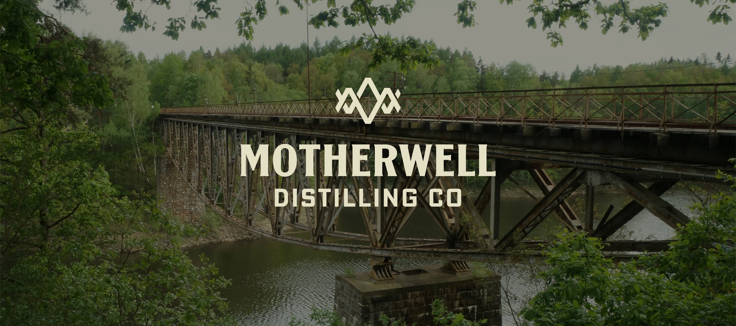
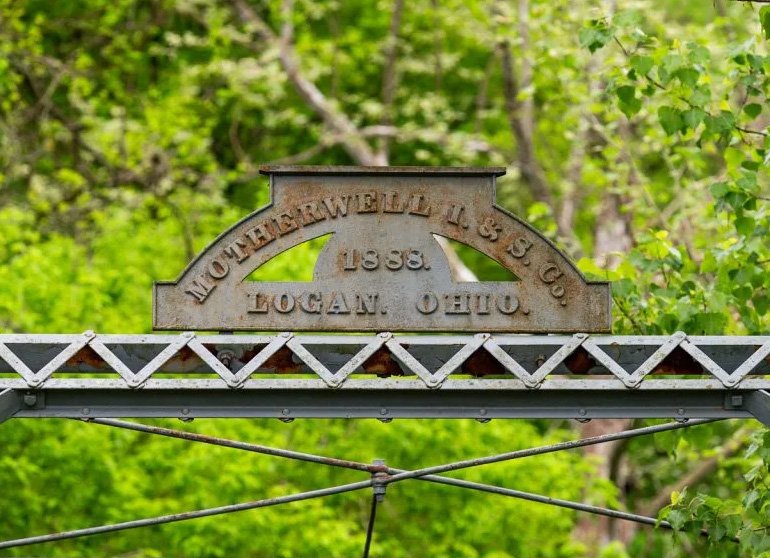
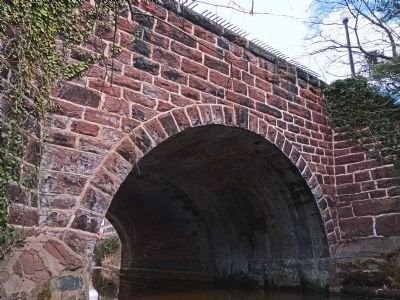
The solution was already in the brand's foundation: the truss bridge beneath Logan's original 'Motherwell Iron & Steel' sign. Carried into the refreshed identity, it became the constant, while Alexandria earned its place on the label, featuring the city's oldest standing crossing, Hooff's Run Bridge.
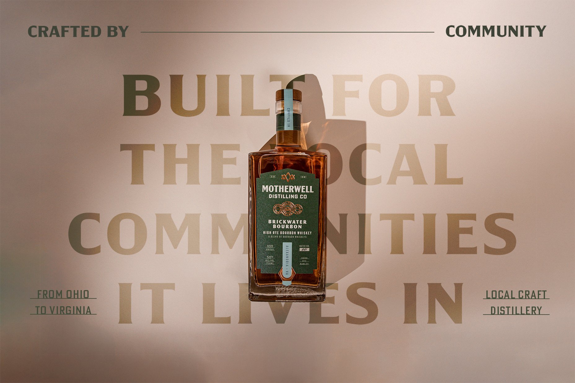
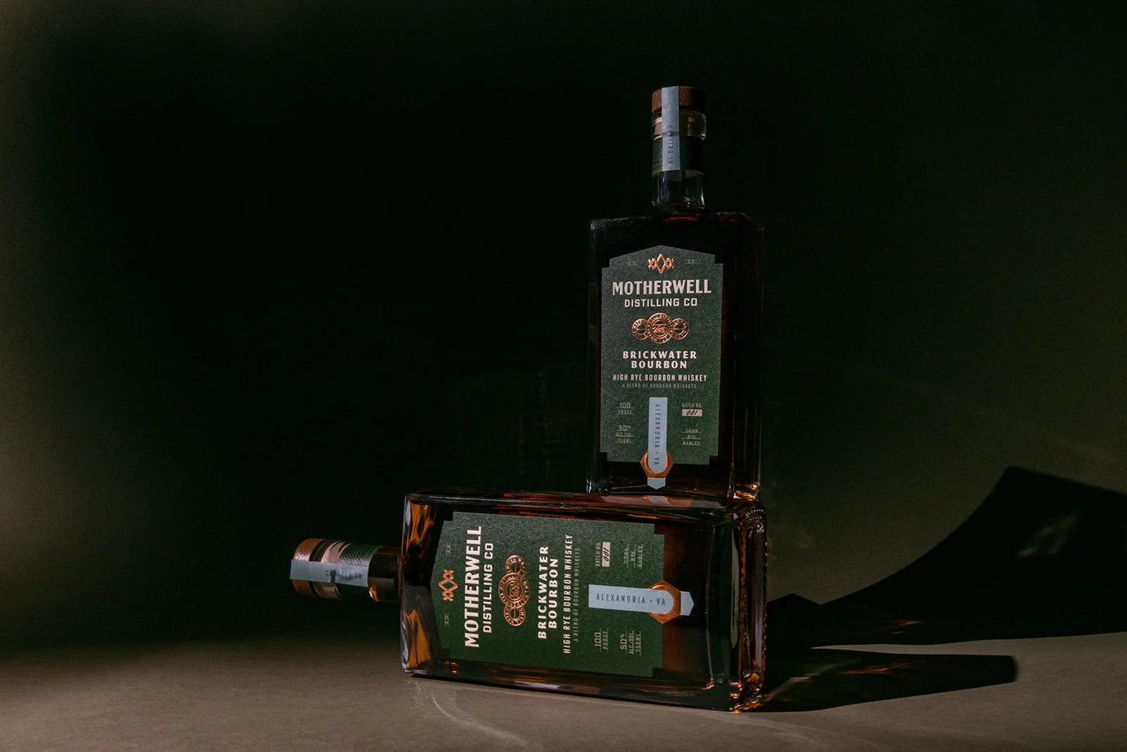
The result is a flexible system built to travel: the truss brandmark holds Motherwell together across every city, while each new location brings its own bridge into the story, ready to welcome the brand's next home.
*Work created while employed at Watermark Design.
BRAND STORYTELLING & STRATEGY
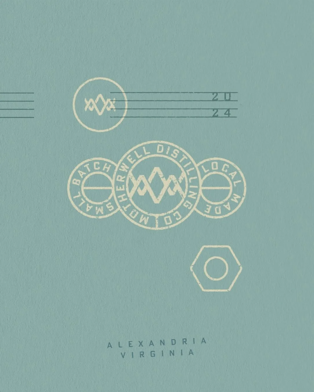
The original 1888 Motherwell Iron & Steel sign in Logan sits atop a truss bridge and part of the original logo remained a symbol for the brand, with a refreshed and modernized look, that more clearly highlights the ‘M’ and ‘W’.
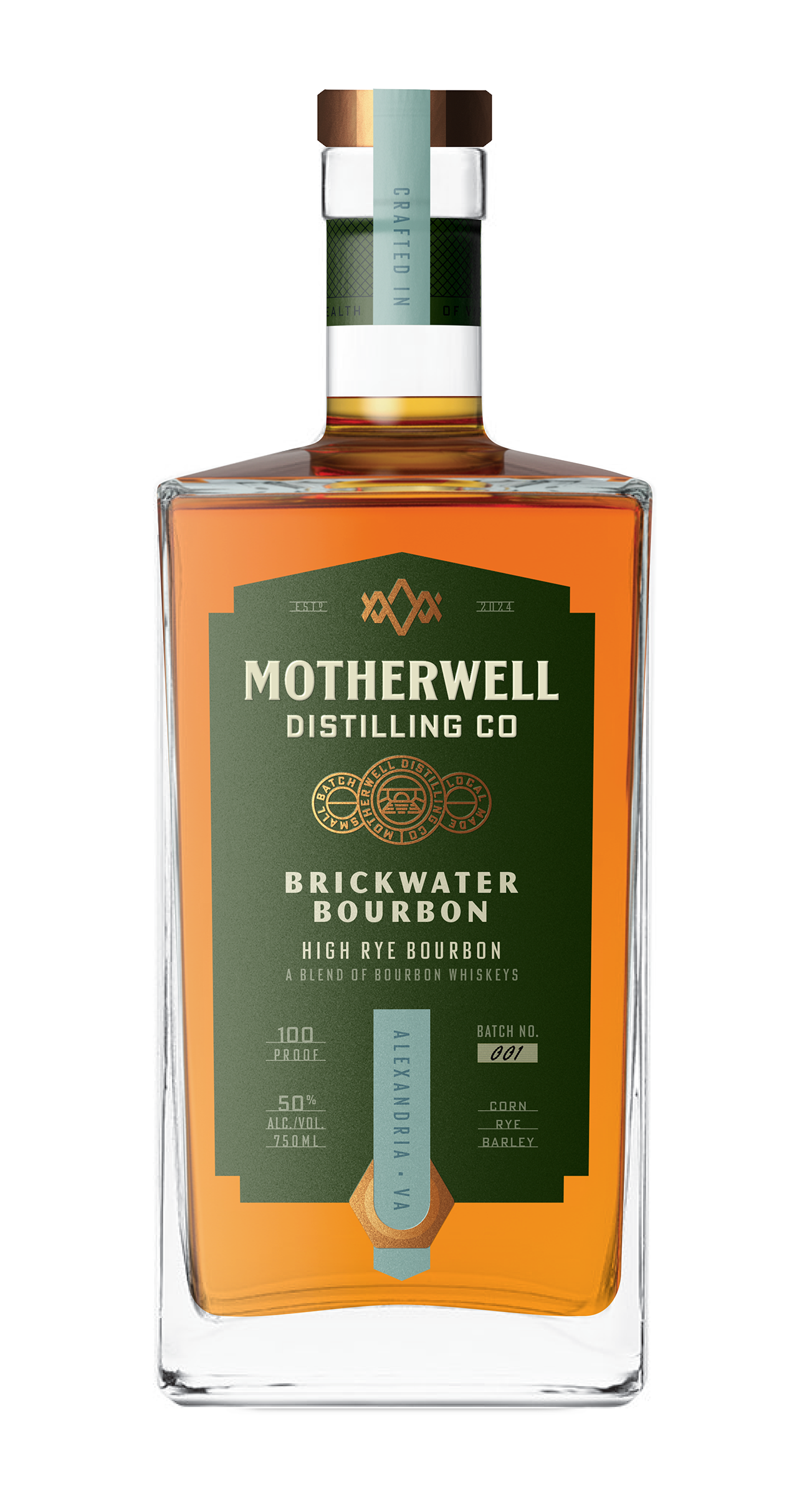
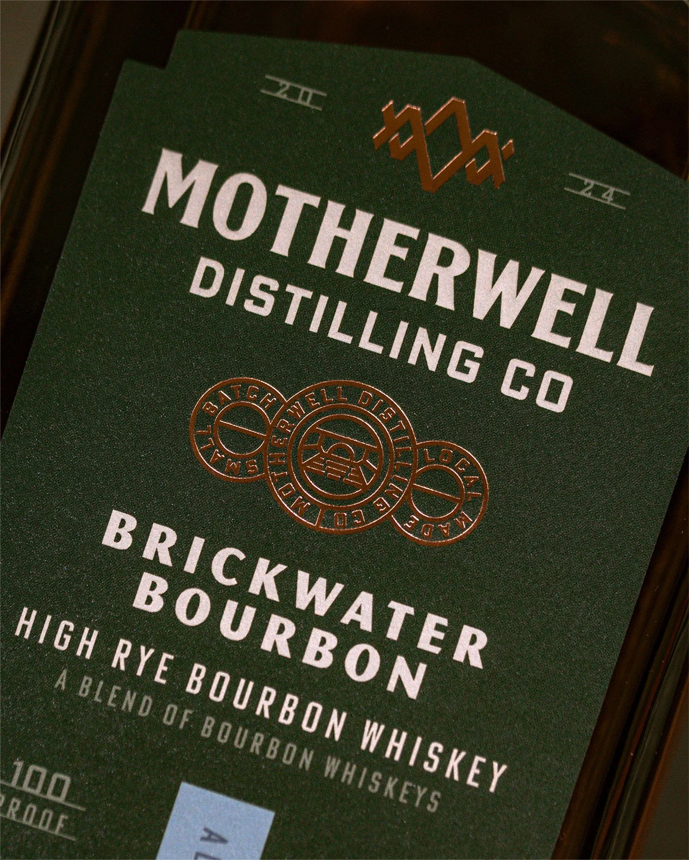
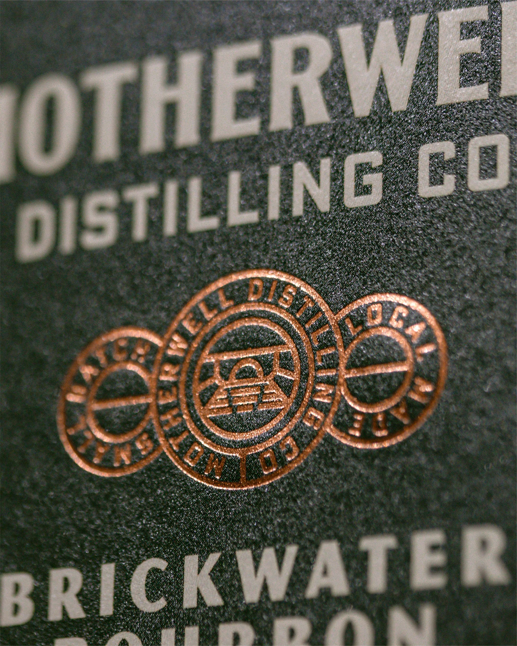
Paying homage to Alexandria’s oldest standing historic crossing, Hooff’s Run Bridge, the icon is stamped into the label’s copper badge – a mark that shifts with each distillery’s home now and into the future.
BRAND REFRESH
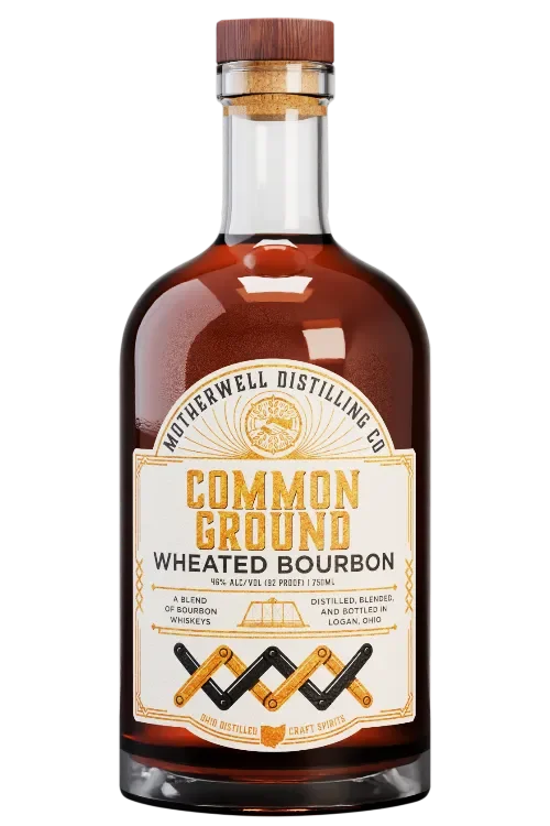
Adapting an established brand for Alexandria meant meeting a market with real expectations: a premium, design-savvy audience with demand for a high-quality local distillery. The original package design had strong bones tied to local landmarks, but the identity was rooted entirely in Logan, with no thread connecting it to Alexandria.
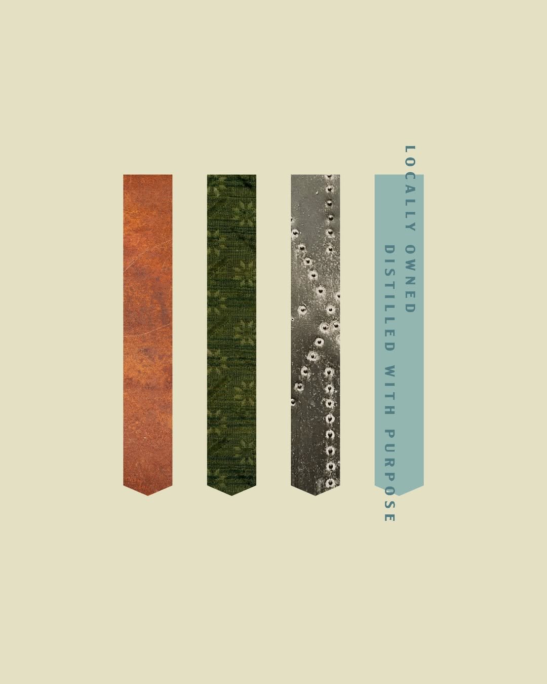
The refresh keeps that storytelling and gives it one cohesive, premium system that speaks to both cities. An elevated, modern feel with rich color and a refined palette, and special moments like a custom dieline, copper foil, embossing, and industrial details that weave in the brand story throughout.
BEFORE
AFTER